Search
The Search pattern offers users an intuitive way to explore content quickly by using keywords. Search is essential to discover information in apps that support large amounts of information. This pattern supports a basic menu driven search behavior, with optional free text behavior and configurable search result items.
The search pattern delivers a robust and versatile search experience, supporting functionalities such as search history, suggested results, and autocompletions. It accommodates various result types, including search result values, secondary labels, icons, and avatars, offering rich and informative content.
Use this pattern to help users
- Locate information in applications with large amounts of data.
- Look through a catalog of items, like a product catalog or a library.
- Navigate to a page or resource.
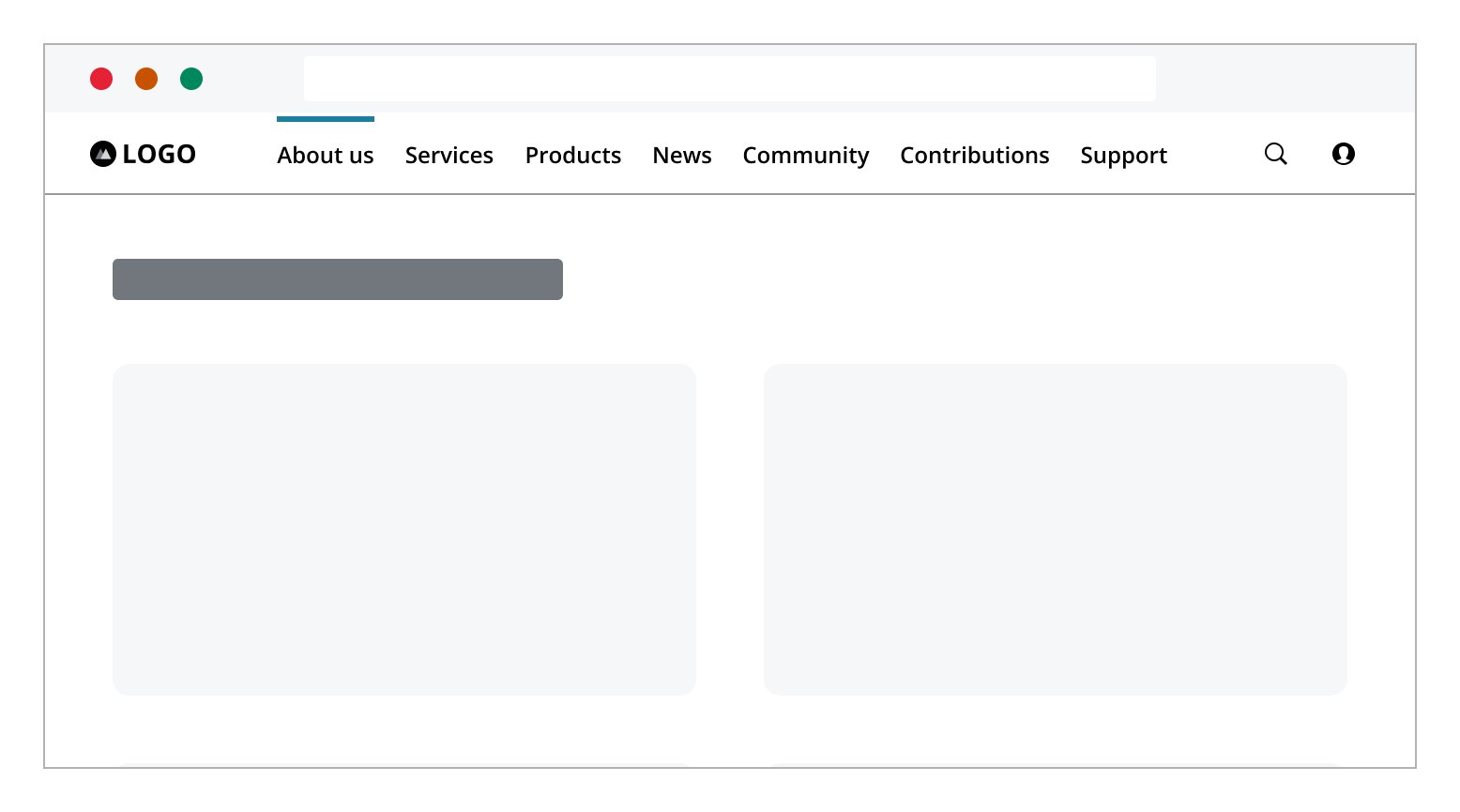
A search pattern can be present in an application, as a global or focused search, depending of the scope of the search functionality. Independently of how a search is presented, the following elements are present in a search pattern:
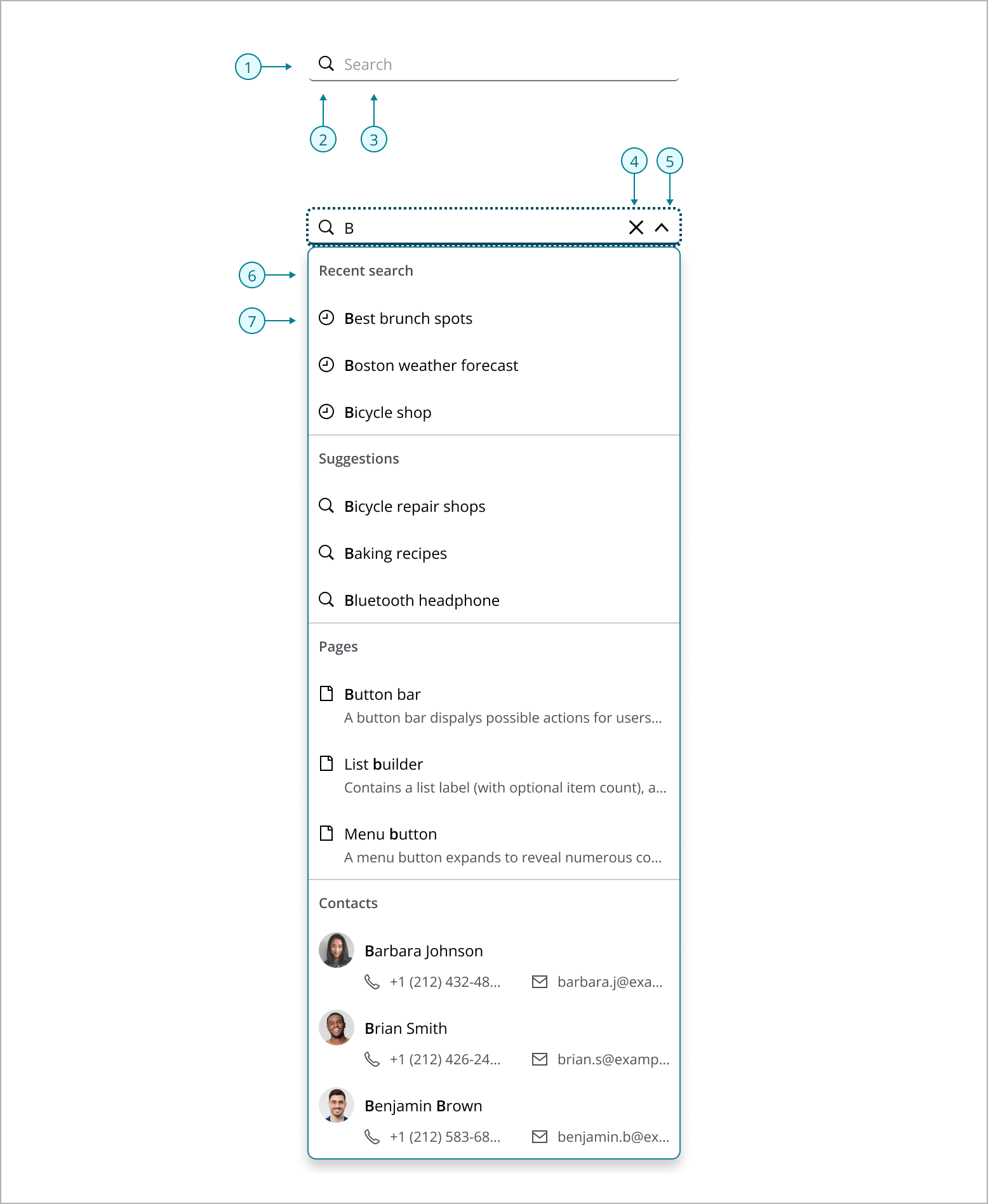
- Search input field: A single input field where users type their queries.
- Search icon: The magnifying glass icon indicates search.
- Placeholder text: Hints to users what information can be searched for. Placeholder text should be clear and tell the user exactly what can be searched for if results are limited. For example, if only page titles can be searched, placeholder text should read “Search page titles.”
- Close button: Close button that appears within the search input field, allowing users to quickly clear their current query and start a new search.
- Expand button: A chevron icon button typically used to indicate that a dropdown menu can be expanded or collapsed.
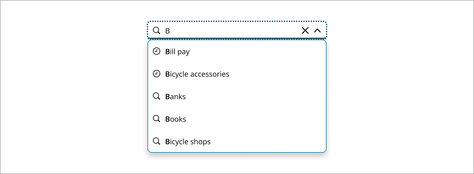
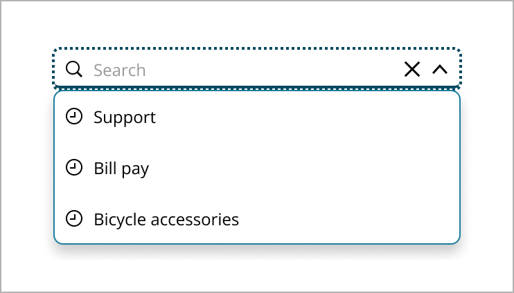
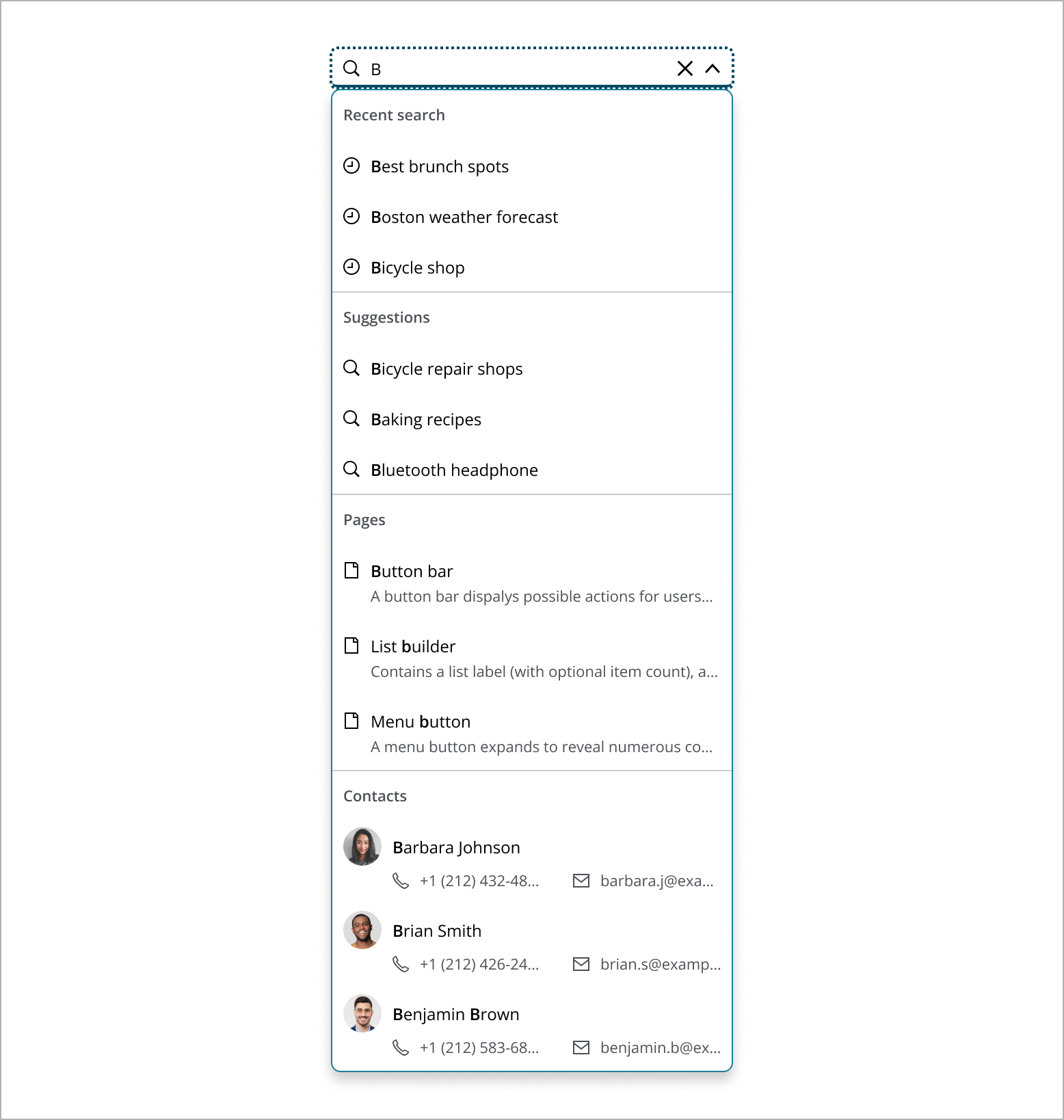
- Section header: A label used to organize search results into distinct categories within the dropdown list. It helps users quickly identify and navigate different types of results, such as recent searches, suggestions, pages, and people.
- Result item: An individual entry within the search results dropdown. It can include various elements such as secondary labels, icons, or avatars.
- Use
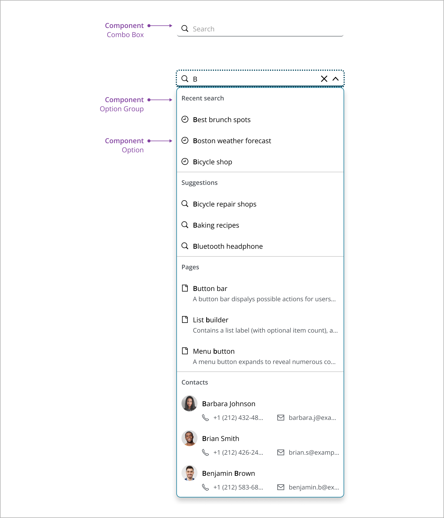
Combo boxto display search field. - Use Option Group to group the search results.
- Use Option to display a search result.
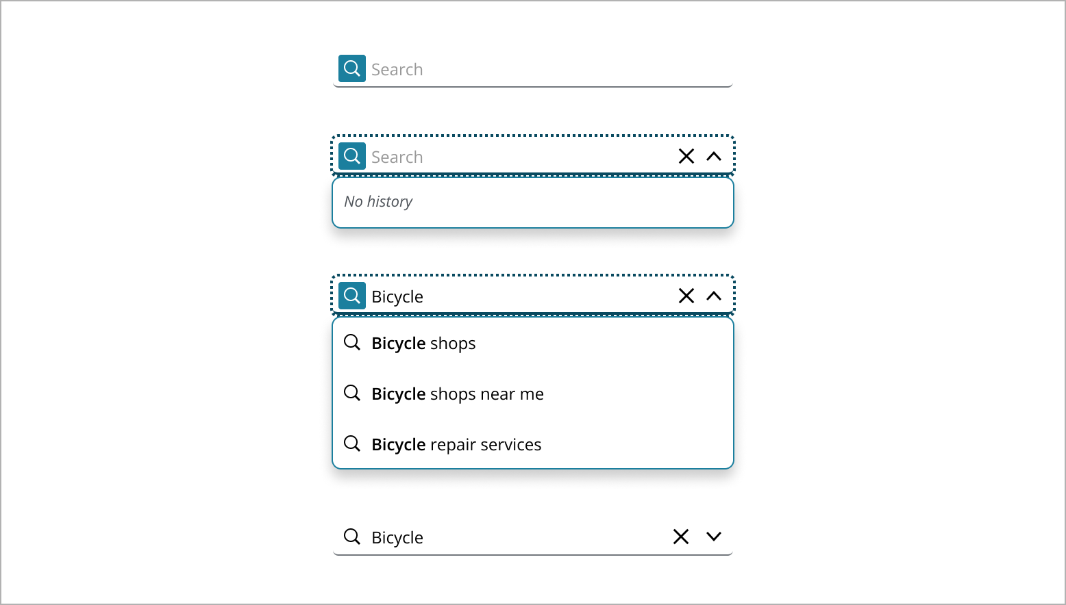
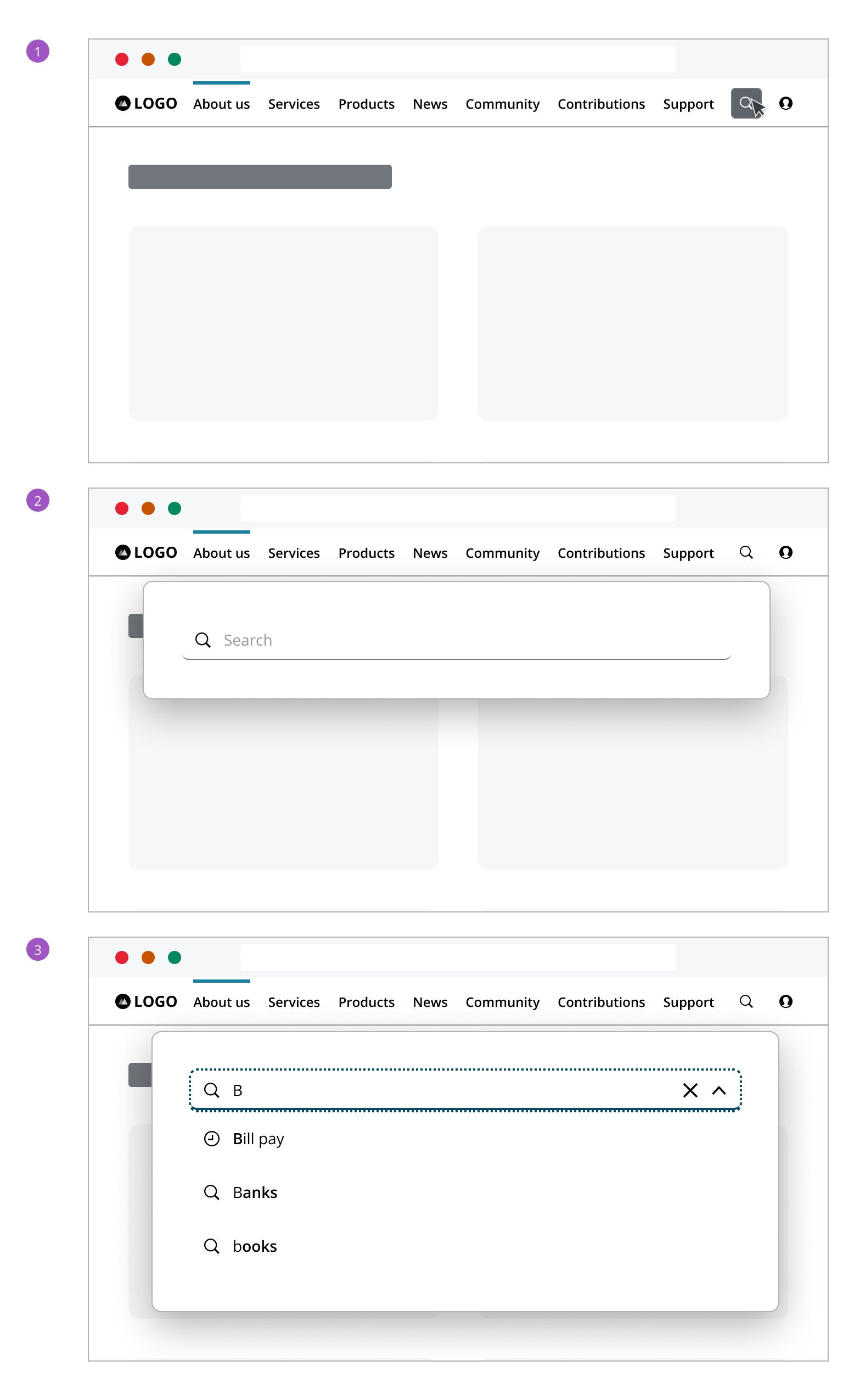
Search field displays with "Search" text, inviting the user to begin their search.

When the user clicks the search field, a search button appears and a dropdown emerges.
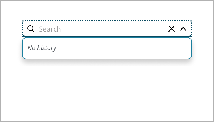
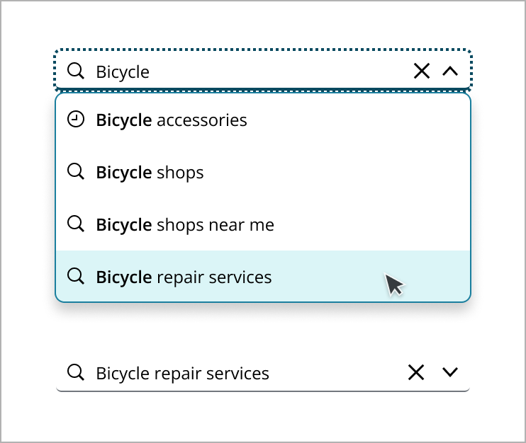
If there are recent searches, a list of past queries appears, providing quick access to previous results.
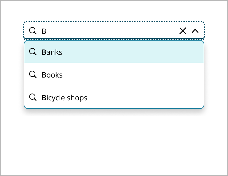
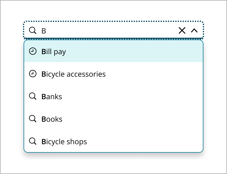
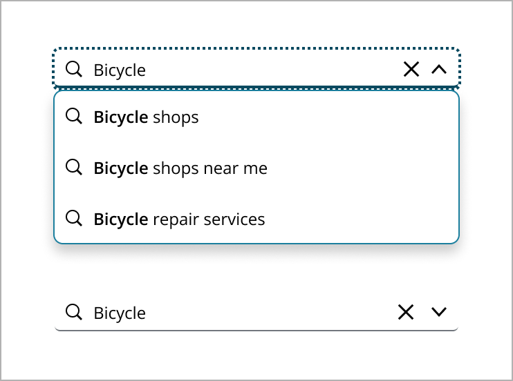
As the user types, a close button appears for easy clearing of the input. The dropdown updates in real-time, offering suggestions that match the input, with bolded text for clarity.
Once the user submits a search, they are directed to the results page. The search field remains visible, showing the entered query, ready for new searches.
Pressing "Enter" after entering a search query will lead the user to the page of the first result in the dropdown.
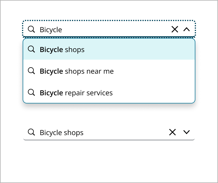
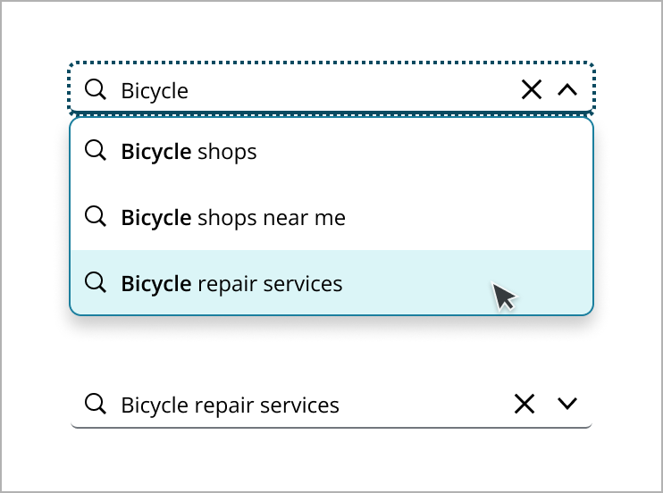
Choosing a suggestion from the dropdown takes the user directly to the page of the selected result.
In addition to returning matching results in the menu, use free text search capability to allow users to enter a custom string to perform a search, returning a search results page with a range of matching results.
Users can navigate through the menu using arrow keys or click on a result to select from the dropdown.
A search button can also be added as an optional element, providing a clear call to action and visual cue, which aligns with user expectations for a more comprehensive search experience.
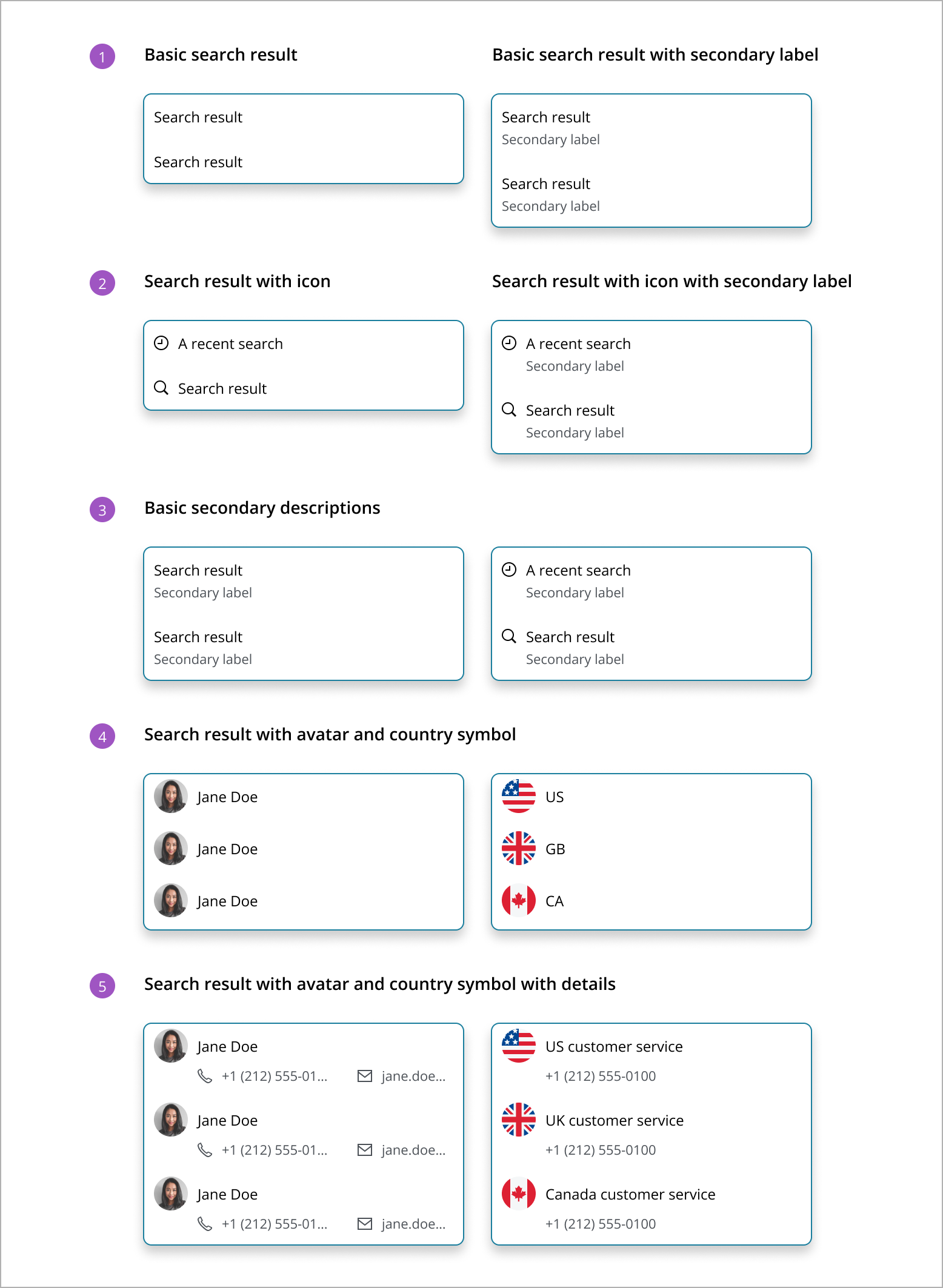
The search pattern currently supports basic search result items that compromise of non-focusable elements: text, icons, country symbols, avatars. The following are examples of the types of results items you can create.
-
Basic search result: Displays only the primary search result value, ideal for straightforward results where no additional context is needed.
-
Search result with icon: Combines a descriptive icon with the primary search result value, useful for visually differentiating results by category or type.
-
Basic secondary descriptions: Adds a secondary label to the search result value, offering additional details or context to clarify the result. A secondary label can be used to indicate the category the item falls into (ie “Publication”), to tell the type of result the item is (ie “Recent Search”), to give more information about the item (ie “by Author Name”) or some other useful identifiable information.
-
Search result with avatar and country symbol: Displays either an avatar or a country symbol alongside the primary search result value. An avatar is best for person-related results, such as contacts or profiles, providing a visual representation of the individual. A country symbol is ideal for results related to geographical locations or entities associated with specific countries, offering a quick visual cue to identify the country associated with the search result.
-
Search result with avatar and country symbol with details: This format combines an avatar or a country symbol with a secondary label alongside the primary search result value. For person-related results, an avatar is used, offering extra information such as contact details. For geographical or country-related results, a country symbol is displayed, providing additional context or information. In both cases, the secondary label enhances the user's understanding by offering relevant details or context associated with the search result.
Indicates that search results are being fetched, typically shown with a spinner used when there is a delay in retrieving results to inform users that processing is ongoing.

Organizes search results into clear categories, such as recent searches, suggestions, pages, and people. This structure helps users quickly find and identify relevant information, making navigation easier and more efficient. By grouping results, users can access all necessary information in a straightforward and user-friendly way, effectively managing complex search scenarios. Within these categories, consider ordering items alphabetically, chronologically, or by relevance, depending on what makes the most sense for the content type. This approach helps users quickly identify and navigate to the type of result they are looking for.
This section provides guidelines for organizing and prioritizing search results in a dropdown menu.
-
Relevance first: Prioritize results based on relevance to the user's query, showing the most closely matching items at the top. Context is determined using user preferences, application section, keyword analysis, and session data, helping tailor results to better match user intent.
-
Recent searches: If applicable, display recent searches at the top. This allows users to quickly access queries they've made before.
-
Suggestions: Provide suggested search terms or autocomplete options that are closely related to the input string. These can help guide users to popular or common searches.
-
Data source priority: If results are pulled from multiple data sources, consider prioritizing sources based on user behavior or business goals. For example, prioritize internal data over external sources if it aligns with user needs.
Large data sets in search results
The Combo Box has limitations in efficiently handling large numbers of search results. For large data sets, consider methods like limiting the results or directing users to a separate search results page to enhance the user experience. For more information, please check this GitHub ticket.
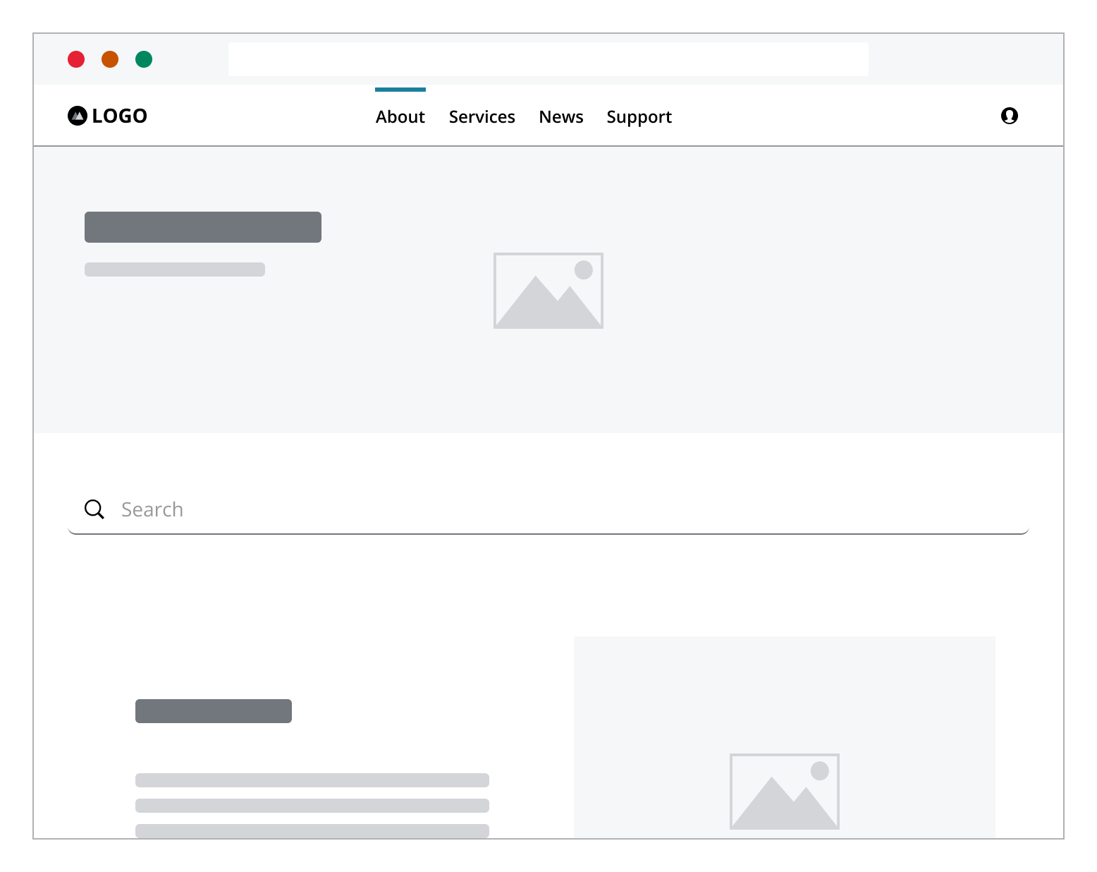
Search is typically located in three key areas for easy access.
Header: Accessible from any page, ideal for global search.
Center: Prominent on homepages, used when search is a primary function.
Expandable search: Starts as an icon button, expanding to a search field or dialog, saving space in minimalist designs.
In situations where space in the header is limited, a magnifying glass icon can be used to represent the search component in a minimized state. When a user clicks the search icon, the search field can expand. By clicking the search icon can open a dialog, displaying the search field. This method provides a more prominent search interface without altering the layout of the top navigation. The search input will return to its minimized icon state when the user clicks outside the component, rendering it inactive.
If you need to expand the pattern or share feedback with us, please contact the team.